
I’m hard-pressed to explain just how incredible this new poster from designer Matt Ferguson for the 40th anniversary of The Empire Strikes Back actually is, but let me try.
Symmetry in Design
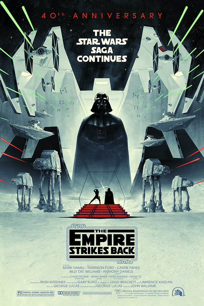
You will always get my attention with graphic design that balances on the page or in the space. Always. So Ferguson’s use of symmetry here, with the balanced elements of AT-ATs, Star Destroyers and more is exactly the style I’m most attracted toward. It all revolves around Vader standing in the center with his meditation chamber open around him, providing an anchor to everything happening around him.
The Empire Resurgent
If you’re going to sell a movie with this title, you should make sure that the visual elements reinforce the same message it’s sending. So the fact that all but one single element in the design come from the Empire is perfectly on-brand. This is the powerful, merciless force that is clearly a threat to the struggling Rebellion, so it works in every possible way. And by making Luke, locked in lightsaber combat with Vader, so small it communicates how minuscule the chances of the Rebels succeeding are within the story.
That Classic Title
Not only does the title itself appear in its classic form, but the whole credits block has a retro vibe, bringing audiences back immediately (at least those who are old enough to remember it) to 1980.
All White
Perhaps it’s because the battle on Hoth was – and still is – my favorite part of the whole movie, I always associate Empire with white, so this speaks to me immediately. The bright white of the Hoth now is mirrored here in the white-gray of the AT-ATs trodding along its surface and that continues up the interior of the meditation chamber to the Star Destroyers and TIE Fighters at the top. With exception of the laser blasts, the only other pop of color here is, again, found in the lightsaber duel happening at the bottom, especially the red lights of the Cloud City staircase. Those lights draw your eye down to the title treatment, part of the natural flow of the design.
